- Meghalaya Gears Up for 39th National Games 2027, convenes North Eastern Inter State coordination meeting in Shillong
- Soltrix Technology Solutions, Inc. Recognized by GoodFirms as a Top ServiceNow® Partner
- Baker Law Group Expands Full-Service Criminal Defense to Denver
- DOAGuru Infosystems Delivers Next-Gen Digital Marketing & Software Services to Power Business Growth
- Government of Meghalaya Hosts Summit for Rural Empowerment: Leveraging Pradhan Mantri Janjatiya Vikas Mission
- 4Closure Rescue Launches National Program to Help Homeowners Avoid Foreclosure
- Intel and Times of India Launch 'The Learning Curve' to Bridge Digital Trust Gap in Education
- Personal Online Reputation Management: Why It’s No Longer Optional
- Kronenbourg 1664 Blanc Brings a Taste of French Elegance to Karnataka
- Dr. Sandeep Marwah Honored in Edinburgh, Scotland for Setting Ten World Records in Media and Education
- Galgotias University Celebrates Its Achievement in QS World University Rankings 2026
- SAIMUN 2025 Welcomes 23 Nations and 26 Schools on One Global Platform
- Certified Softwash Solutions Celebrates 7 Years of Exterior Cleaning Excellence in Windsor-Essex
- Tranzlatex Launches as a Global Leader in Translation and Transcription Services
- Solaralm Partners with SolarEdge Solutions to Deliver High-Quality Solar Appointments Across the USA
 Mail to a Friend Mail to a Friend |
|
     |
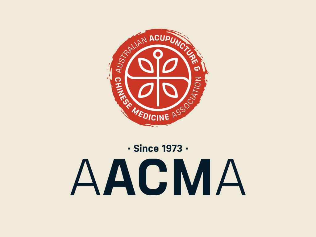
Jam&Co Designs New Brand Identity for AACMA

Jam&Co were tasked with creating a revolutionary brand for the Australian Acupuncture & Chinese Medicine Association (AACMA). AACMA is a professional association that endeavours to support its members by advocating and advancing Chinese medicine at any opportunity ? from the public, universities, health funds and government.
The new brand needed to reflect AACMA's connection to the ancient wisdom that is Chinese Medicine whilst also showcasing the contemporary values and continuous advancement of learning that is critical to AACMA.
The chosen concept was one that creates a unique brand mark through symbols. Each symbol has a purpose that speaks to the brands belief of Life in Harmony. Red is a strong colour in Chinese culture so it was a natural fit for the branding, we then introduced a deep navy which brings an essence of modernity and professionalism to the design.
The brand was then rolled out onto several pieces of corporate collateral including business cards, email sign-offs, accreditation certificates and a corporate letterhead.
Company :-Jam&Co Design Pty Ltd
User :- Jennifer Segail
Email :-designjamandco@gmail.com
Phone :-61-2-92113883
Mobile:- -
Url :- http://jamandco.com.au/


